They’re all saying that visualisation tools make big data come alive. Nick Booth is not so sure.
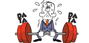
In this modern era of big data, there are many heart sinking moments brought on by the excessive use of information.
 Infographics are one of the modern scourges of the information age. I can’t be the only person in the world who feels a wave of anxiety whenever one of these visual interpretations is mooted. They’re supposed to be quick and fun ways of graphically illustrating a complex point – but somehow they’re not. Anything that’s pre-announced as fun usually isn’t. It’s such a hard billing to live up to. But the creators of infographs always seem to make the subject even more confusing – to me at least.
There’s nothing wrong with infographics, just the way people use them. Sometimes it looks like the author of the report has started with the intention of creating a pretty diagram, then rapidly tried to backfill the various fields with headings.
Typically, you’ll be presented with a diagram resembling a biological deconstruction of flower parts. Instead of headings like stamen, sepal and stigma, the big data chart’s regions have headings like customer data, supplier data and financial data. But there didn’t seem to be any order in them, or relationship between the different entities.
Unlike the flower diagram, which gave some idea how of how, say, the nectary helps to enable the function of the flower’s ovules, there were no such obvious relationships between the big data categories. It’s almost as if, in haste, someone just put as many category names onto a chart as they possibly could.
It was ever thus, of course. I can remember presenting a report for a large UK telecoms company, which shall remain nameless. This company, which had recently enjoyed a near monopoly, was now facing competition for its channels to market. The pros and cons of the CSP’s offering could have been summarised on a single sheet of A4 paper but the marketing boss didn’t want that. So I had to make up 45 minutes worth of spider charts in order to pad out the presentation. These charts were created out of the values typed into the cells of an Excel spreadsheet. These scores were themselves pretty random as the interviewees I was asked to quiz became so bored with rating so many attributes they just scored everything seven out of ten.
So we could have created a short, punchy memorable feedback report. It would have been more valuable to give each person one useful tip they could have put immediately into practice. But instead, thanks to a data binge, many of the sales staff dozed off and had to be resuscitated from a trance. And it wasn’t my fault – well not entirely. Big data was to blame. In the wrong hands it can be lethal.
The tool of presenting big data actually made it harder to understand. This happens everywhere. With all the functions available on broadcast media, we should be entering a golden age of TV. Instead, I find most documentaries on telly unwatchable. The narrative is usually so ploddingly slow that it insults the intelligence and tests the patience to the limit. This is usually because the programme makers want to include every plot device available to them from the vast smorgasboard of televisual delights on offer. So instead of following the story of why and how rogue builder A ripped off pensioner B, we’re forced to watch the presenter describing his journey of discovery and his preparations for the final confrontation scene. In the old, small data days, the smug ugly show-off would have been kept behind the camera, and his involvement in the narrative kept to a minimum. But not now. If you watch a consumer affairs programme, for example, you get the impression that the show is all about the presenters – and their journey.
The problems of both infographics and broadcast TV are to do with big, rich data. In each case, the user is given so many options for mining and presenting information that they have lost the plot. They feel as if they have to use them all, forgetting that the most important discipline in the information age is to make everything appear to be simple and clear.
I think some data austerity is needed. Or perhaps a data diet and some simple exercises. Otherwise we’ll all get bloated, lethargic and liable to fall asleep at our desks.